Python Scatter Plots
Scatter Plots in Jupyter Notebooks
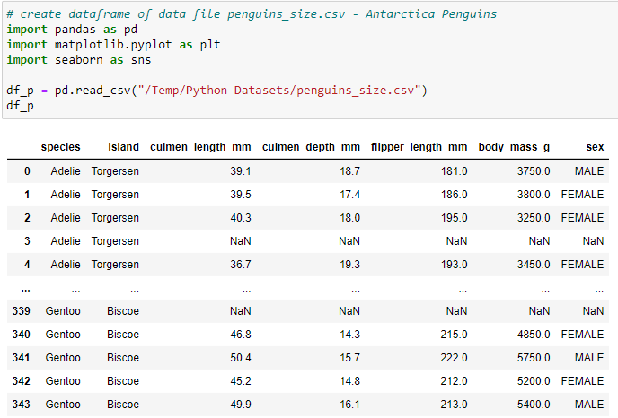
This article describes how to create a Scatter Plot Charts from a CSV dataset file using Matplotlib & Seaborn. The CSV dataset file (penguins_size.csv) was downloaded from Kaggle https://www.kaggle.com/datasets/parulpandey/palmer-archipelago-antarctica-penguin-data?resource=download. The first scatter plot will use matplotlib to display the Antarctica penguins species and compare their culmen (beak) length and depth.
Load the dataset into a DataFrame
Write code to use pandas to read the CSV data into a DataFrame (df_p) and then write a statement create a second dataframe where the NaN records are Dropped.
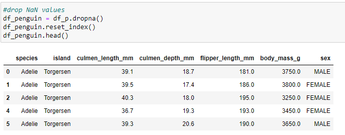
Code for second dataframe dropping the NaN values & resetting the index.
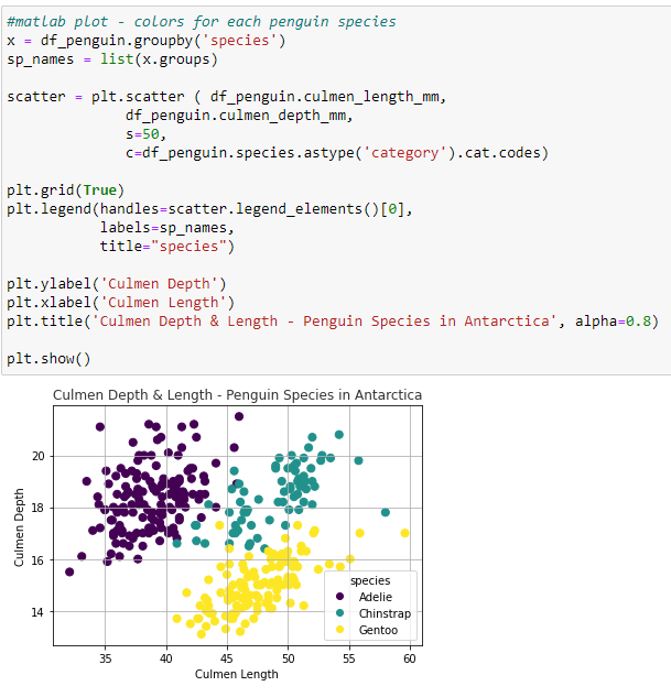
Matplotlib Scatter Plot - Create a list of species from the dataframe for the Legend. Code the scatterplot with the values for the dataframe culmen Length (X-axis) and the culmen depth (Y-axis) by Penguin Species. s = the size of the marker in points. c = a 2 dimensional array for the colors plotted. plt.legend produces the scatter plot with labels and Title.
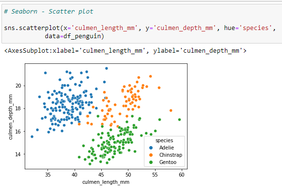
Seaborn Scatter Plot - Using the same dataframe, df_penguin, the Seaborn scatterplot code requires the x-axis and y-axis values columns from the dataframe and the Hue to color the data separately for each species.
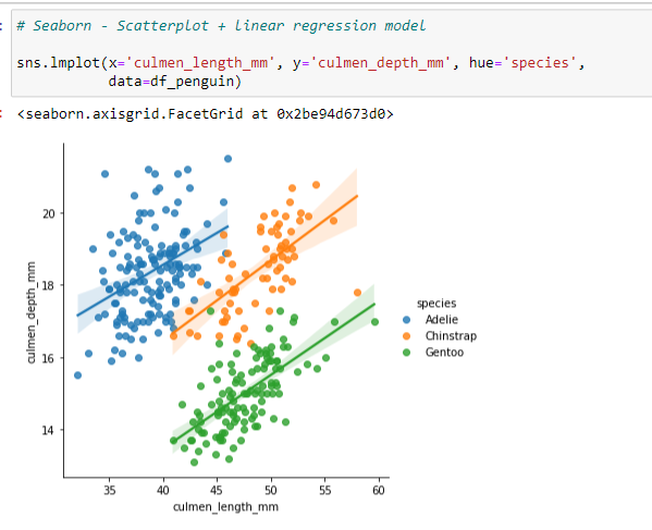
Seaborn Scatterplot with Linear Regression Model - Create the code to output the chart to include the Size, Title, Y-Axis, and data for plt.bar.
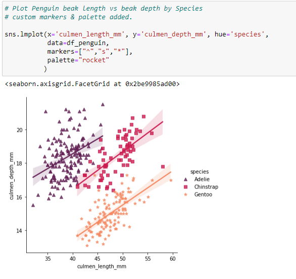
Using the same code for the sns.lmplot, this example uses markers to differentiate the Species (^ = Triangle, s = Square, * = Star). The color palettes information may be found on the seaborn website: http://https://seaborn.pydata.org/tutorial/color_palettes.html
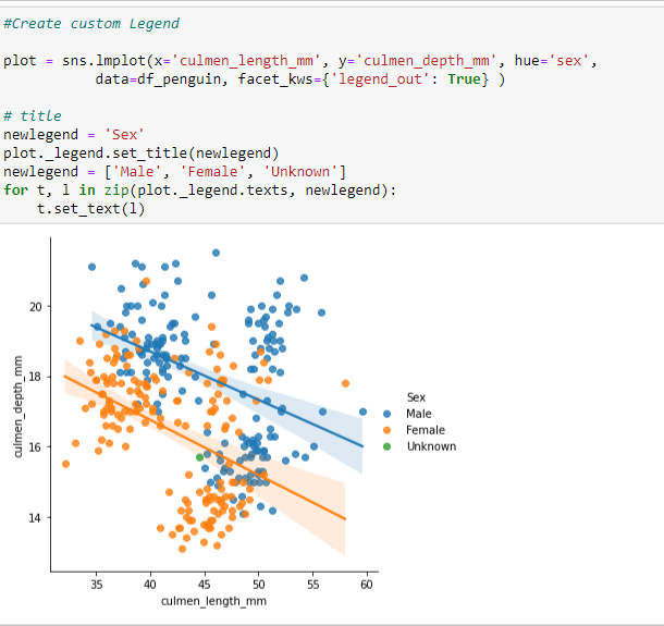
Custom Scatterplot Legend - additional scatterplot with missing information.
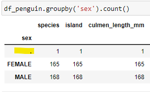
Write code to produce a scatterplot to display the differences in Culmen length & depth by the sex of the Penguins. The output appears to have a value of "." for the Sex of one of the dataframe records.
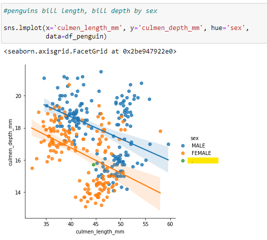
The issue with the additional value in the dataframe is confirmed.
Create a Custom Legend to account for this missing data using a List for the Legend.
Custom Scatterplots using "Row" - An alternate method would be to generate a clean dataframe to create the scatterplots.
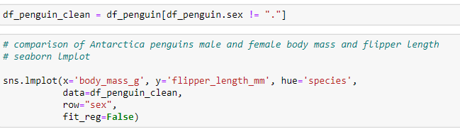
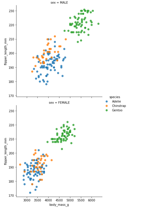
Using the addition of the Row in the lmplot, 2 separate scatterlots are produced - one for male penguins, one for female penguins.