Power BI - Excel Power Pivot Source Data
Power BI Using Pivot Table from Northwind SQL Database
This article describes the creation of a Power BI data visualization report that uses a Pivot Table in Excel 2013 that is generated from Excel's Power Pivot utility and connected to a SQL Server 2014 instance of the Northwind Database. This Power BI report utilizes a Treemap, a Pie Chart, and a Funnel to provide an interactive data visualization of total lifetime sales.
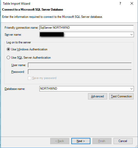
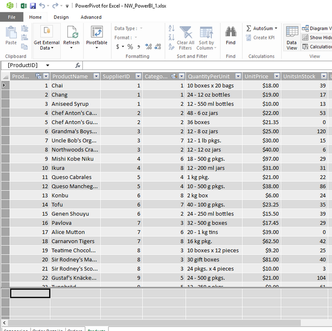
1. Open Excel and go to Power Pivot and select Manage to open it. Select Home, Get External Data, From Database, From SQL Server. Connect to the Server Name and select the Northwnd database from the drop down and click next.
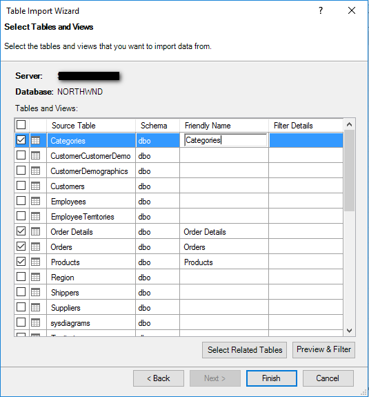
2. Select pick tables and click next and pick Order, Order Details, Products, and Categories.
3. Click Finish and wait for the Table import wizard to complete.
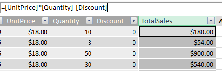
4. Click on Order Details and Insert Column to the right of Discount and put in the formula "=[UnitPrice]*[Quantity]-[Discount]" and hit Enter. Change the Column name to TotalSales and format the column from General to Currency.
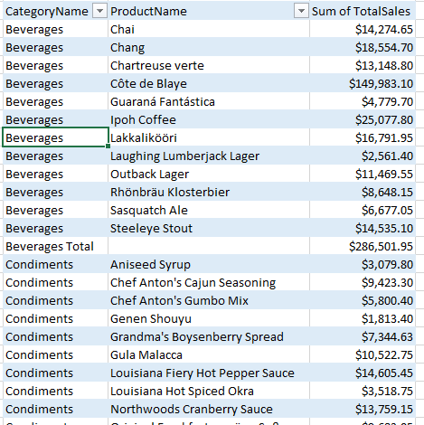
5. Click Pivot Table and select Flattened Pivot Table and click OK when it asks which sheet to insert it into. In the Pivot Table worksheet, check Category Name, Product Name, and Total Sales.
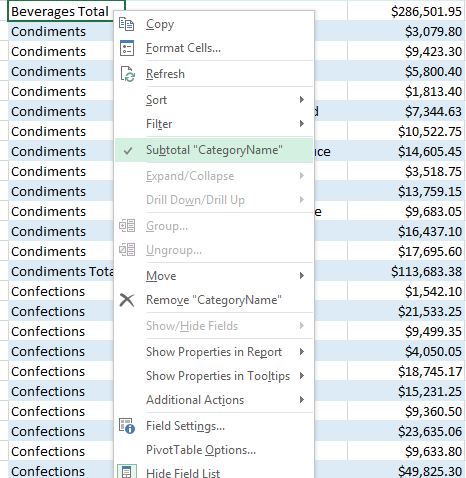
6. Remove the Category Subtotal from the Pivot Table by right clicking and selecting Subtotal CategoryName.
Power BI Report Creation
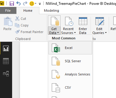
1. Client on Home, Get Data and select Excel.
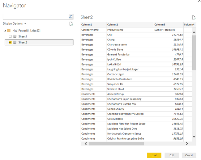
2. Select the Worksheet with the Pivot Table data and click on Load.
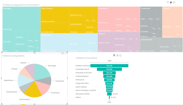
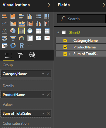
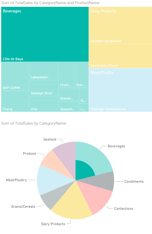
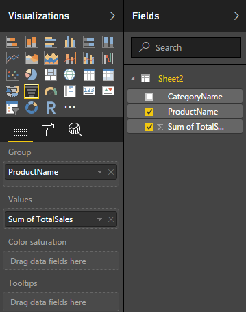
3. Select Treemap from the Visualizations section and from the Fields section drag and drop Category Name into the Group box, ProductName into the Details box, and Sum of TotalSales into the Values box. The report should appear with different colors for each Category and smaller boxes for each product in each Category.
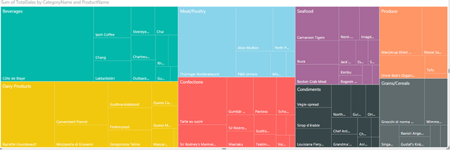
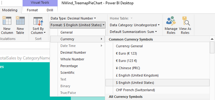
4. Click on any product in the Treemap and hover over it to view the total sales and notice that it appears as a Decimal number without any formatting. To Format to Currency, click on Sum of TotalSales in the Fields section and go to Modeling tab and select Format to change from General to Currency, English (United States). Click on the Product and hover over it again to see the change in the Sum of TotalSales field. Notice that you can get detailed information about each product within each color \ category in the treemap. Next, how to get the totals by each Category...
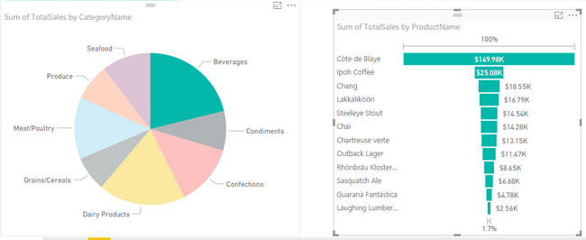
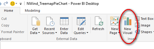
5. Click on New Visual in the Home tab to add another report. Select the New Visual and select Pie Chart from the Visualizations section.
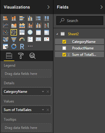
6. Drag Categories to the Details box of the Pie Chart and Sum of TotalSales to the Values box.
7. Click on each Pie section and notice that the Total Sales for the Category is displayed and the percentage of total sales is in parentheses. Click on the Sum of TotalSales to change the Format to Currency - English (United States). Also notice that all Products within the Category selected in the Pie Chart are highlighted in the Treemap above as the Visualizations are connected.
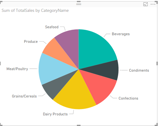
If you click on a Product in the Treemap, you can see that a portion of the Category in the Pie Chart is highlighted and when you hover over it, the Category selected is listed with its percentage of total sales and an additional line for the Highlighted Product's percentage of total sales of All Categories.
8. Add a funnel visualization to capture the breakdown of the product sales by Category. Add the Product Name as the Group and the Sum of TotalSales as the Values for the Fields.
9. Click on the category in the Pie Chart to view a breakdown of products and Total Sales for each in the Funnel.